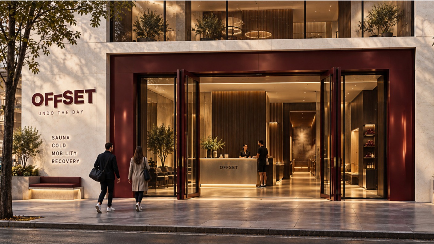
Offset
Undo the day.
A members' recovery club built around one instruction — undo the day — carried across spatial signage, environmental design and a digital product built to get people through the door.
- Brand identity
- Spatial signage
- Environmental design
- Digital product
- Campaign & OOH
A city too tired to notice its own tension, and a club built to interrupt it.
Offset isn’t a gym and it isn’t a spa — it’s a members’ recovery club squeezed into the working week: contrast therapy, mobility work, percussion massage, breathwork and sound, all under one roof, on the way home rather than instead of it. The brief was to build an identity that made recovery feel like a status symbol, not a chore — something worth walking past your own gym for.
That meant refusing the category’s usual softness. No candles-and-linen wellness clichés, no pastel calm. Offset needed to look considered and a little severe — oxblood and concrete instead of sage and rattan — so the promise of “undo the day” reads as a decision, not a treat.
The hardest part was making that promise legible before a member ever books a session. The instruction had to live in the architecture itself — on the door, on the walls, on the locker key — so the space explains what it does without a single line of marketing copy.
Signage as the loudest brand asset — the room does the talking.
Oxblood and warm concrete carry the identity everywhere it travels — the wordmark, the door, the app. Inside, that same voice is cut directly into the walls: HOTTER, COLDER, LOOSER, CALMER, FURTHER above the plunge pool; MOVE, RELEASE, RECOVER, REPEAT across the movement floor; LOWER, SLOWER, DEEPER, BRIGHTER, YOU along the sound lounge. Members don’t read a brochure — they walk through one.
- Brand identity
- Spatial signage
- Environmental design
- Digital product
- Campaign & OOH
The instruction, built into the room.
Click any photo to view it larger.
Same instruction, three screens.
The site sells the decision, the app runs the membership — booking, zone tracking, locker access — and the social templates keep every launch post reading like the same club, not a new one each week. Oxblood, Switzer, one line of copy: the system had to hold at every size, from a 6-sheet poster down to a thumbnail in a feed.
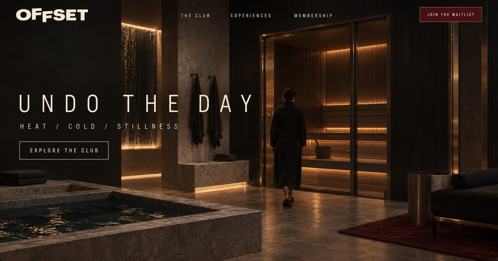
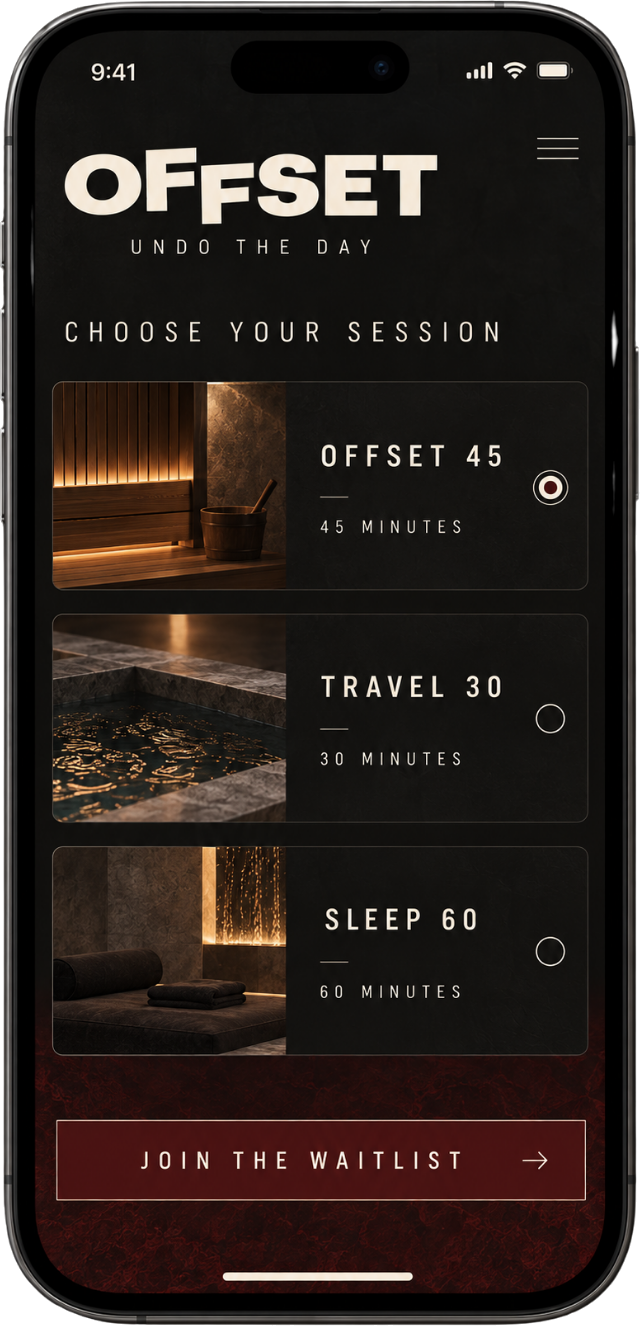

A club that explains itself before anyone opens the app.
The result is a system where the identity does the selling before a single word of copy is read — a door that tells you what happens inside, a wall that coaches you through the session, and a digital product that carries the same oxblood discipline from the homepage to the booking confirmation. One instruction, undo the day, shipped consistently across every surface members touch.
Got something good? Let’s make it move.
Tell us what your marketing team is carrying, and where an extra senior brain would help most.
Start the conversation