Nosh
Real food. Further.
A challenger meal brand rebuilt as one confident, loud system — identity, packaging, campaign and collaborations, shown here as it shipped.
- Brand identity
- Packaging
- Campaign & OOH
- Brand collaborations
- Digital & delivery
A shelf full of noise, and one brand that needed to cut through it.
Nosh launched into a category where every fridge shelf looks the same — soft focus photography, gentle pastels, a promise of “wellness” that reads as background noise. The brief was to build an identity loud enough to stop a scroll and a scan, then carry that same energy across packaging, campaign and collaborations.
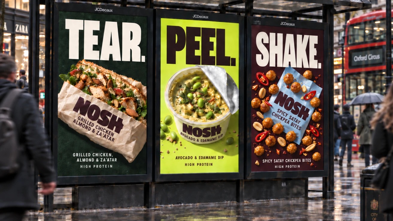
Rather than a shelf of soundalike SKUs, we built the range around one blunt instruction per pack — Tear, Peel, Shake — so it tells you what to do before you’ve read a word of copy. Limited drops with Pip & Nut, Tony’s Chocolonely and Nando’s carried that same voice into collabs loud enough to earn their own OOH run.
The hardest part was keeping it sensory. Nosh is genuinely good food — real ingredients, high protein, nothing to hide — but it needed to be sold with the craveability of fast food: the tear of a wrapper, a fork cracking through a chocolate shell, a bag shaken hard enough to hear it. Every photograph, every headline had to make you hungry first and informed second.
One system, colour-coded, built to travel from pack to poster to plate.
Aubergine and coral carry the core brand voice; lime, sky and peach rotate through the range so regulars can spot “their” product at a glance. Tone of voice stayed short, blunt, a little cheeky — copy that sounds like it was written by someone who actually eats the food.
- Brand identity
- Packaging
- Campaign & OOH
- Brand collaborations
- Digital & delivery
The system, shipped.
Click any photo to view it larger.
Loud on a poster, just as loud on a screen.
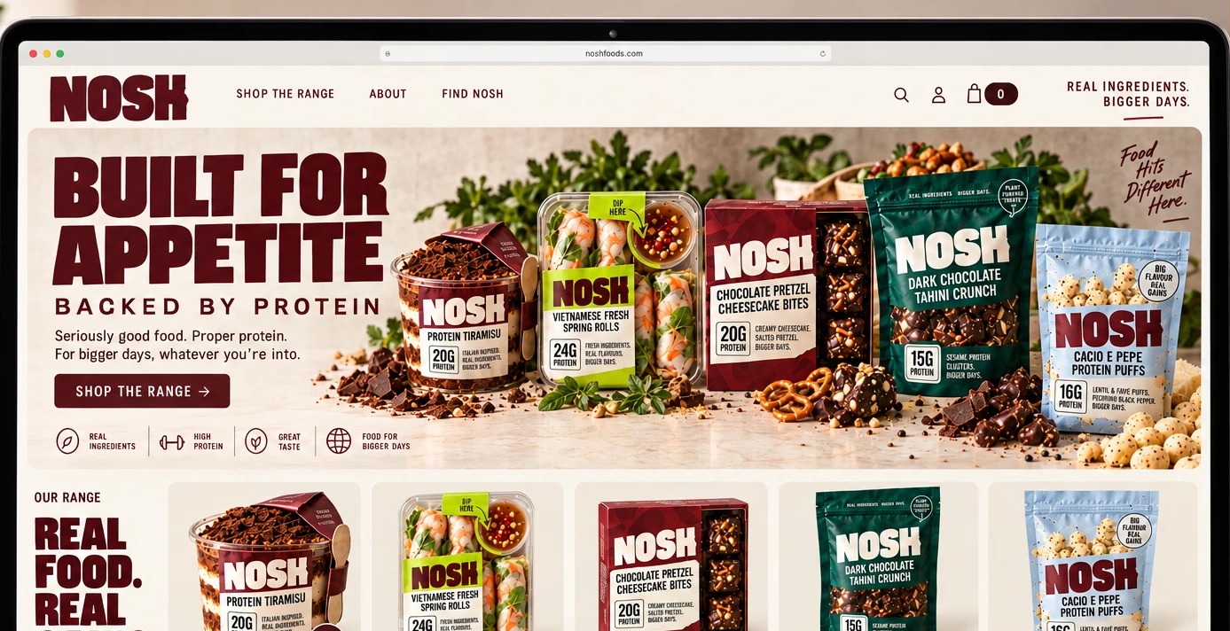
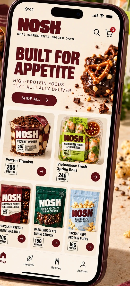
The same blunt, colour-coded system carries straight into the site and app — Tear, Peel, Shake reads exactly the same whether it’s stopping you on a bus shelter or in a shopping cart.
A shelf presence that reads at arm's length.
The result is a system that carries its energy everywhere Nosh shows up — a pack you can spot from across the aisle, a billboard that reads in half a second, and a delivery listing that still feels unmistakably Nosh, not a bolted-on afterthought. One identity, shipped consistently across every surface.
Got something good? Let’s make it move.
Tell us what your marketing team is carrying, and where an extra senior brain would help most.
Start the conversation